FIGURE

FIGURE 6

ID
ZDB-FIG-211111-30
Publication
Mayeur et al., 2021 - When Bigger Is Better: 3D RNA Profiling of the Developing Head in the Catshark Scyliorhinus canicula
Other Figures
All Figure Page
Back to All Figure Page
FIGURE 6

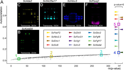
Autocorrelation as an indicator of profile regionalization. (A) Graph showing autocorrelation values (y-axis) and their statistical support [-ln(p-value) on x-axis] for all gene models. Each dot corresponds to a single gene model, in gray if the corresponding total digital expression is below 100, otherwise in black. Gene models with null p-values are shown on the right of the graph with –ln(p-value) = infinite (Inf). Horizontal arrowheads point to dots corresponding to a selection of genes, exhibiting clearly regionalized expressions in ISH experiments. Color codes for these genes are shown boxed in black. Colored boxes delimit sectors of the graph numbered from 1 to 5 and containing gene models with decreasing p-values/increasing autocorrelations (green, sector 1; yellow, sector 2, cyan, sector 3; blue, sector 4; magenta, sector 5). (B–F) Digital transverse sections showing examples of profiles observed in sectors 1 (B), 2 (C), 3 (D), 4 (E), and 5 (F). The corresponding gene identities are indicated and sections are numbered from posterior to anterior.

Expression Data

Expression Detail
Antibody Labeling
Phenotype Data

Phenotype Detail
Acknowledgments
This image is the copyrighted work of the attributed author or publisher, and ZFIN has permission only to display this image to its users. Additional permissions should be obtained from the applicable author or publisher of the image. Full text @ Front Cell Dev Biol