
- Title
-
Brain-wide visual habituation networks in wild type and fmr1 zebrafish
- Authors
- Marquez-Legorreta, E., Constantin, L., Piber, M., Favre-Bulle, I.A., Taylor, M.A., Blevins, A.S., Giacomotto, J., Bassett, D.S., Vanwalleghem, G.C., Scott, E.K.
- Source
- Full text @ Nat. Commun.
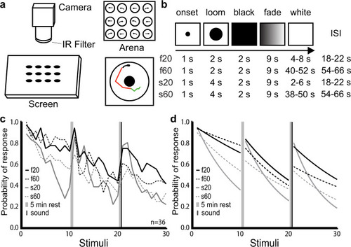
Modulation of habituation by stimulus features.
a Schematic representation of our setup for measuring visual habituation behavior. A 12-well chamber with one larva in each well (top right) was filmed on a horizontal screen (left) on which the looms were presented. Automated tracking recorded periods of swim bouts (green) and burst swim (red) for each larva (bottom right). b Stimulus train properties across the 4 experimental groups. In all cases, the stimulus appeared for 1 s before expanding over a 2-s (fast) or 4-s (slow) period. The resulting black screen was maintained for 2 s before fading to white over a 9 s period, followed by a variable period of white screen prior to the next stimulus period. The average ISI for each type of stimulus is shown in the right column: 20 s for f20 and s20, and 60 s for f60 and s60. ISIs were varied slightly to prevent the timed prediction of consecutive stimuli. c Probability of response across the 4 groups during three blocks of ten loom presentations. Probability was calculated at each loom presentation as: number of responding fish divided by total number of fish (n = 36). d Fitted exponential one-phase decay curves of the response probability for each group. The consistency of these results across different clutches of larvae is presented in Supplementary Fig. 1. |
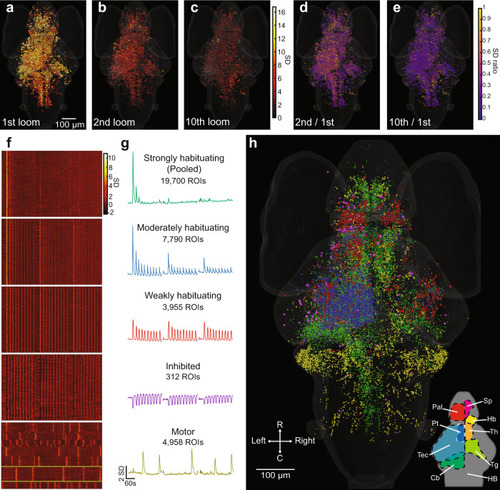
Activity of individual ROIs and their functional clusters during habituation.
a Responses of ROIs across the brain to a loom stimulus, color-coded for the normalized intensity of their response. b, c The same ROIs’ responses to the second and tenth looms. d, e The degree of habituation in each of these ROIs in the second and 10th trials, calculated as the ratio of response to the first loom. This analysis was restricted to ROIs showing clear responses (with a coefficient of determination (r2 value) > 0.5 for the linear regression between their response and a regressor simulating a calcium signal) for the first loom stimulus. Raster plots (f) and mean response traces (g) of the ROIs composing each of five functional clusters, with a clear correspondence to the three blocks of ten stimuli. The x axis scale at the bottom of g also applies to f. h Anatomical locations for the ROIs belonging to each functional cluster (colors matching the mean traces in g). Since different animals startled in different trials, we identified the motor cluster using a different regressor for each animal. The mean responses are shown for a single animal in this cluster in g, with yellow lines indicating the relevant neurons from that animal in f. A rotation of h can be found in Supplementary Movie 1, and the distributions of these clusters are detailed in virtual sections in Supplementary Fig. 5. Data shows the pooled responses of 11 larvae to the f20 stimulus train. Relevant anatomical brain regions are indicated in the bottom right corner of h, each shown for only one side of the brain. Pallium, Pal; subpallium, Sp; thalamus, Th; habenula, Hb; pretectum, Pt; tectum, Tec; tegmentum, Tg; cerebellum, Cb; and hindbrain, HB. R, rostral; C, caudal. |
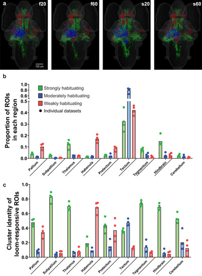
Brain-wide responses during different loom stimulus trains.
a Brain-wide distributions of the functional clusters from Fig. 2 for each of four loom habituation paradigms. b Averaged proportions of ROIs in the four data sets, from the brain’s total number of each functional cluster, located in the indicated brain regions. c Averaged proportion of each cluster’s representation among the loom-responsive ROIs in each brain region. The individual paradigms (f20, f60, s20, and s60) are represented as circles, n = 4 paradigms. Statistical analysis of these proportions is detailed in Supplementary Tables 1 and 2. |
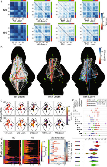
Graph model of the visual loom network during habituation.
a Correlation matrices for activity of 99 nodes representing ROIs across the whole brain. The functional clusters to which each node belongs are indicated on the axes, using the color code from Fig. 2. Darker blue shades represent stronger positive correlations for any given node pair, and red indicates negative correlations (see color scale, a). b A graphic representation of correlations across the 99 nodes, whose functional clusters are indicated by their colors and anatomical positions represented spatially. The colors and width of the lines indicate the relative correlation across the f20 and f60 experiments (f20 correlation minus f60 correlation), where red indicates stronger correlations in f60 and blue indicates stronger correlations in f20 (see color scale). Only edges with correlations above 0.75 in either the f20 or the f60 matrices are displayed. c A heat map of the participation coefficient for each of the 99 nodes during the 1st, 2nd, 3rd, 10th, and 11th loom stimuli of the f20 and f60 experiments. d Raster plots showing the participation coefficient of each node across the first 11 stimuli for f20 and f60, and the relative participation (f20 value minus f60 value) where blue indicates stronger f20 participation and red indicates stronger f60 participation. The functional clusters for each node are indicated, using the color code from Fig. 2. e Changes in correlation strength for edges from the 10th to the 11th looms of f20, indicating the impact of the recovery from habituation. Values shown are calculated for each edge as its strength in the 10th loom minus its strength in the 11th loom, with more negative values indicating edges that showed more pronounced recovery between the 10th and 11th looms (top). The functional clusters for each edge’s two nodes are color-coded and the brain regions that the edges span are indicated on the left. Violin plots (bottom) show the cumulative distributions of edges connecting different types of functional clusters (left). Dashed lines indicate the median and dotted lines indicate the first and third quartiles. |
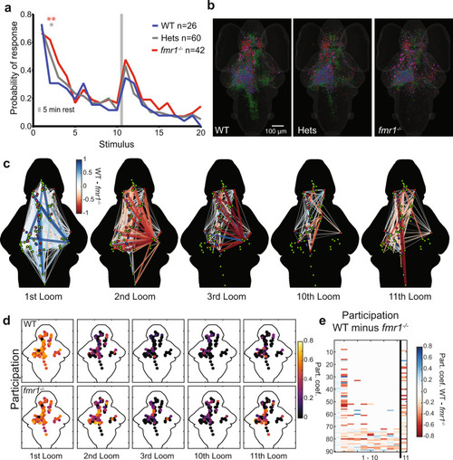
Behavioral and network-wide changes in fmr1−/− larvae.
a Probability of response across the three groups to two blocks of ten looms. Over the course of two blocks of 10 stimuli, fmr1−/− larvae show slower habituation and stronger recovery than WT siblings, and heterozygotes show an intermediate phenotype. One-sided binomial test: fmr1−/− versus WT: 2nd Loom (p = 3.056e−5); 3rd Loom (p = 0.034); 11th Loom (p = 0.055); 16th Loom (p = 0.039). Heterozygotes versus WT: 2nd Loom (p = 0.001) and 9th Loom (p = 0.039). All other comparisons (p > 0.1). Significance cutoffs using a Bonferroni correction are *p < 0.00125 and **p < 0.00025, equivalent to uncorrected p < 0.05 and 0.01, respectively. b Brain-wide distributions of ROIs for the three genotypes, color-coded for functional cluster as in Figs. 2 and 3a. A random sample (n = 11) of Hets was selected to match WT (n = 10) and fmr1−/− (n = 11). c Node-based graphs showing relative correlations (WT correlation minus fmr1−/− correlation), where blue indicates correlations that are stronger in WT and red indicates correlations that are stronger in fmr1−/−. Larvae imaged to generate the graphs for WT = 10 and fmr1−/− = 11. d Heat maps of participation for all nodes across habituation and recovery. e A raster plot of relative participation (WT participation minus fmr1−/− participation) for each node through the first 11 trials. |
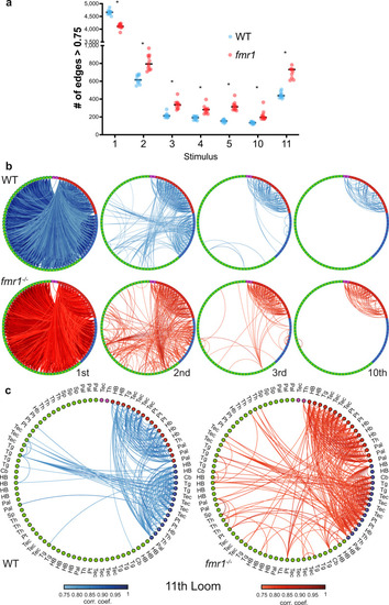
Graph structure of WT and fmr1−/− habituation networks.
a Comparison of the average number of edges >0.75 at different loom presentations using the leave-one-out approach to generate group-averaged matrices for WT (n = 10) and fmr1−/− (n = 11). WT presents more edges at the 1st loom and fmr1−/− fish at the following loom presentations, including the first loom after recovery (the 11th). Repeated measures two-way ANOVA (one-sided) with the Geisser–Greenhouse correction followed by a Šidák’s multiple comparisons test. WT vs fmr1 > 0.75 edges Predicted mean diff., p values of multiple comparisons test (and Šidák’s correction adjusted p values): 1st Loom = 546.9, p ≤ 0.0001 (p ≤ 0.0001); 2nd Loom = −192.3, p ≤ 0.0001 (p ≤ 0.0001); 3rd Loom = −121.7, p ≤ 0.0001 (p ≤ 0.0001); 4th Loom = −94.98, p ≤ 0.0001 (p = 0.0001); 5th Loom = −165.6, p ≤ 0.0001 (p ≤ 0.0001); 10th Loom = −81.07, p = 0.0006 (p = 0.0039); 11th Loom = −311.1, p ≤ <0.0001 (p ≤ 0.0002). Black horizontal bars indicate the median. b, c Functionally sorted brain-wide graphs for WT and fmr1−/− larvae. Edges with correlations above 0.75 are shown between all combinations of nodes, and nodes are arranged by their functional clusters (Green: Strongly habituating; Blue: Moderately habituating; Red: Weakly habituating; Magenta: Inhibited). Graphs are shown for trials 1, 2, 3, and 10 (b), and trial 11 (c). The brain region to which each node belongs is indicated in (c), and is consistent across (b) and (c). Pallium, Pal; subpallium, Sp; thalamus, Th; habenula, Hb; pretectum, Pt; tectum, Tec; tegmentum, Tg; cerebellum, Cb; and hindbrain, HB. |
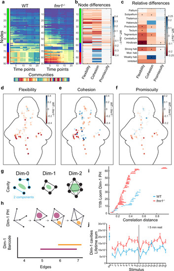
Dynamic community detection and persistent homology across WT and fmr1−/− graphs.
a Example community detection results obtained with γ = 1.6 and ω = 0.9. b Relative (WT minus fmr1−/−) values of flexibility, cohesion, and promiscuity for each of the nodes. c Relative values of flexibility, cohesion, and promiscuity for 9 brain regions and by functional cluster. The color represents the difference of the median (WT minus fmr1−/−) and * indicates statistical significance (p < 0.00384) for a Friedman’s test (one-sided) and Bonferroni correction. Details can be found in Supplementary Table 3. d–f Heat map of the relative (WT minus fmr1−/−) values of flexibility (d), cohesion (e), and promiscuity (f) for individual nodes across the brain. g Conceptual examples of structures that can be analyzed with the persistent homology method. h Schematic example of a persistent homology analysis. Persistent homology tracks cavities (pink and orange regions) across a sequence of networks in which edges are added according to their decreasing correlation strength (top), and the lifespans of these cavities can be represented as edges are added (bottom). i Example dimension 1 barcode graphs for fmr1 mutants and WT at the 11th loom. j Lifetime sums in dimension 1 of fmr1 mutants (red) and WT (blue) at pre-loom and 20 loom time points. Results for dimensions 0 and 2 are shown in Supplementary Fig. 11a–e. Centre represents the mean and error bars indicate 95% CIs. |