FIGURE SUMMARY
Title

High activity and high functional connectivity are mutually exclusive in resting state zebrafish and human brains

Authors
Zarei, M., Xie, D., Jiang, F., Bagirov, A., Huang, B., Raj, A., Nagarajan, S., Guo, S.
Source
Full text @ BMC Biol.

Visualization of neuronal activity landscape at cellular resolution in the larval zebrafish forebrain. A Overview of the classification of individual ROIs (neurons) based on their level of activity. The variance of df/f of each ROI was used as a measure of its activity. The k-means algorithm was used to classify each ROI into 3 levels. B Sorted ROIs (left) vs. clustered ROIs (right) based on their activity level for an example subject. C Pie chart showing the percentage of ROIs in three activity level categories for an example subject. Less than 2% of ROIs are highly active (level I) but more than 80% are largely inactive. D Dorsal and lateral views of the three activity categories of ROIs’ distributions in the example subject’s forebrain. E Raster plot of ROIs with different levels of activity in an example subject: (left) activity level 1 and (right) activity level 3. F Percent of total recorded neurons in each activity level category across 9 subjects. G Overlay view of highly active neurons (level 1) in all 9 subjects shows that they are located in the lateral part of the forebrain. H Anatomical distribution of activity level 1 neurons sorted based on the percentage of total recorded neurons in each anatomical mask. The number of replicates used is 9

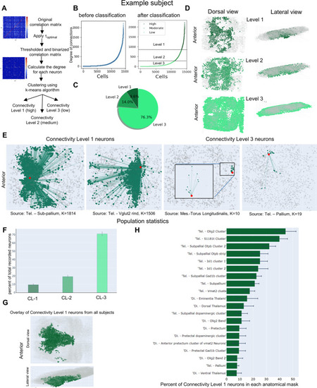
Classification of neurons based on their degree of functional connections. A Overview of the classification of individual ROIs (neurons) based on their level of functional connectivity (degree). The Pearson correlation coefficient was used to calculate the correlation matrix, which was then thresholded using the optimal threshold value. The k-means clustering algorithm was used to cluster ROIs based on their degree. B Sorted ROIs (left) vs. clustered ROIs (right) based on their functional connectivity level for an example subject. C Pie chart showing the percentage of ROIs in three connectivity level categories for an example subject. The ROIs with the highest level of functional connectivity is the smallest group (around than 8%). D Dorsal and lateral views of the three connectivity categories of ROIs’ distributions in the example subject's forebrain. E The connectivity of ROIs with the connectivity levels 1 and 3 in the example subject brain. F Percent of total recorded neurons in each functional connectivity level across 9 subjects. G Overlay view of highly functional connected ROIs (level 1) in all 9 subjects shows that they are located in the medial part of the forebrain. H Anatomical distribution of connectivity level 1 neurons sorted based on the percentage of total recorded neurons in each anatomical mask. The number of replicates used is 9

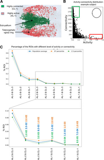
Highly active and highly connected neuronal populations occupy complementary domains in the larval zebrafish forebrain. A Overlay of highly active (red) and highly functional connected ROIs (individual neurons) in the larval zebrafish forebrain across 9 subjects. The highly active cells are in the lateral area whereas the cells with a high level of functional connectivity are located in the medial area. B Connectivity levels (Y-axis) of all neurons sorted based on their activity (X-axis) in an example subject. Red and blue boxes denote neurons of high activity and high functional connectivity, respectively. The dotted circle denotes where highly active and highly connected neurons are expected. C The population distribution curve of all neurons with different levels of activity and functional connectivity. Note that neurons that have high activity and high connectivity are non-existent. The number of replicates used is 9

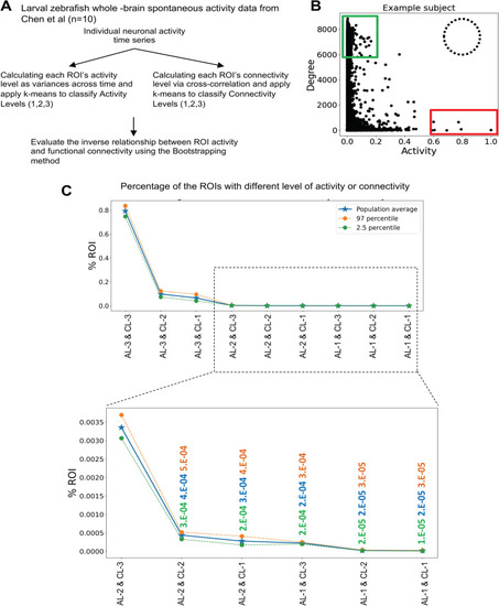
Non-overlapping distribution of highly active and highly connected neuronal populations in the whole larval zebrafish brain. A Schematic diagram showing the analysis pipeline applied to the whole brain spontaneous activity data from larval zebrafish (n=10). B Connectivity levels (Y-axis) of all neurons sorted based on their activity (X-axis) in an example subject. Red and blue boxes denote neurons of high activity and high functional connectivity, respectively. The dotted circle denotes where highly active and highly connected neurons are expected. C The population distribution curve of all neurons with different levels of activity and functional connectivity. Note that neurons that have high activity and high connectivity are non-existent. The number of replicates used is 10

Shuffled, noise-added, and simulated data show activity-connectivity relationship that is distinct from the brain data. A Schematic showing the generation and analysis of noise-added, shuffled, or simulated data. BE Different datasets with neuronal activity time series (top), cell-wise correlation matrix (middle), and the graphed functional connectivity and activity relationship (bottom). B Original data of an example subject. C Different levels of noise were added to the original data, resulting in the loss of the activity-connectivity relationship observed in the original brain data. Note that the Y axis range is different across the panels. D Neuronal activity time series of the original data were shuffled in both space and time. The activity-connectivity relationship observed in the original brain data was lost. E A simulated dataset shows the activity-connectivity relationship that is distinct to the brain data and is also sensitive to the levels of noise. The number of replicates used is 9

Largely non-overlapping distribution of highly active and highly connected regions in the resting state human brain. A Overview of the classification of individual ROIs (brain regions, n=105) based on their level of activity and functional connectivity (degree). Variations of the brain region activity across time was used as a measure of activity and the Pearson correlation of brain regions’ activity was used a measure of functional connectivity (degree). The k-means clustering algorithm was employed to cluster the brain regions into three levels based on each measure. B Percent of total ROIs in each activity level category. C Percent of total ROIs in each functional connectivity level category. D Highly active (red) and highly connected regions (green) across all subjects (n=74). E Connectivity levels (Y-axis) of all brain regions sorted based on their activity (X-axis) in an example subject. Red and blue boxes denote regions of high activity and high functional connectivity, respectively. The dotted circle denotes where highly active and highly connected brain regions are expected to locate. F The population distribution curve of brain regions with different levels of activity and functional connectivity. Note that brain regions that have high activity and high connectivity are non-existent. The number of replicates used is 74

Acknowledgments
This image is the copyrighted work of the attributed author or publisher, and ZFIN has permission only to display this image to its users. Additional permissions should be obtained from the applicable author or publisher of the image. Full text @ BMC Biol.