
Fig. 4
- ID
- ZDB-IMAGE-231207-61
- Publication
- Konadu et al., 2023 - Excess glucose or fat differentially affects metabolism and appetite-related gene expression during zebrafish embryogenesis
- All Figures
- Figures for Konadu et al., 2023
|
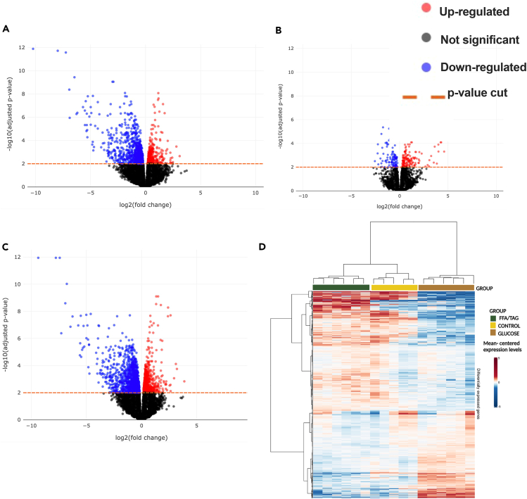
Fig. 4 Gene association test (A–D) Volcano plots for all comparisons showing significance (as -log10 transformed p value) against magnitude (log2 (fold change). Genes identified as significantly differentially expressed are represented as red (upregulated) or blue (downregulated) or black (non-significant) dots. The horizontal orange line represents the applied p value threshold A. Glucose versus Control; B. FFA/TAG versus Control; C. Glucose versus FFA/TAG injected D. Heatmap showing gene intensity per sample relative to the average level across all samples. Individual genes are shown on the Y axis while samples are shown along the X axis. Red and blue cells correspond to higher and lower RNA-seq levels, respectively.