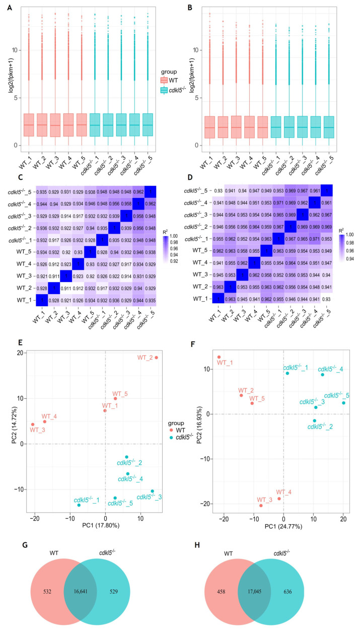
IMAGE

Figure 1

ID
ZDB-IMAGE-250715-108
Source
Figures for Varela et al., 2025
Image
Figure Caption

Figure 1

Comparison of gene expression levels between cdkl5−/− mutant zebrafish and WT siblings at 5 dpf (A,C,E,G) and 35 dpf (B,D,F,H). (A,B) Box plots of the distribution of gene expression levels based on log2 transformed FPKM (Fragments Per Kilobase of transcript per Million mapped reads) values for each sample. The abscissa axis is the sample name, and the ordinate axis represents the log2 (FPKM + 1) values. (C,D) Heatmap of the square of Pearson correlation coefficients (R2) among the ten sequenced samples. (E,F) Principal Component Analysis (PCA) maps based on the gene expression value (FPKM) of samples. The abscissa axis is the first principal component (PC1) representing the most variation in the data, and the ordinate axis is the second principal component (PC2), representing the second most variation in the data. (G,H) Venn diagram of gene expression indicating the number of common and uniquely expressed genes in the WT siblings and cdkl5−/− groups.

Acknowledgments
This image is the copyrighted work of the attributed author or publisher, and ZFIN has permission only to display this image to its users. Additional permissions should be obtained from the applicable author or publisher of the image. Full text @ Int. J. Mol. Sci.