
|
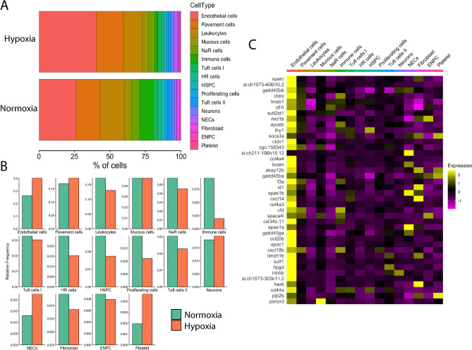
Fig. 6
Effects of chronic hypoxia on gill cell composition and global gene expression. (A) Stacked bar graph shows the relative difference in % cell composition between normoxic and hypoxic conditions. Cell types are coded by colour and are indicated at the right. (B) Bar graphs showing changes in relative cell frequency in normoxia (green) vs. hypoxia (orange) in each cell cluster. (C) Heatmap showing the distribution of the top 40 highly differentially expressed genes in chronic hypoxia compared to normoxia. Scaled gene expression is shown by colours, where yellow indicates relatively high expression and purple indicates relatively low expression.