
|
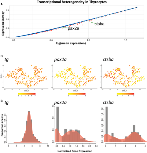
Fig. 6 A. Dot plot depicting expression entropy on y-axis against average gene expression on x-axis for the thyrocyte population. Each dot depicts a gene, with red dots depicting genes that show statistically significant (P < 0.05) difference in entropy from expected value. Expected value is represented by black regression line. pax2a and ctsba are marked on the graph. B. t-SNE plot of the thyrocyte cluster with expression of tg,pax2a, and ctsba. The color scale represents the normalized expression counts for each gene ranging from lowest (yellow) to highest (red). B’ Histogram overlaid with density plots depicting the distribution of normalized gene expression for tg, pax2a, and ctsba.